Wednesday, September 29, 2010

Brick Wall Self Portrait


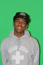
In this exercise we had to move are picture in to a brick wall background. The hardest part was removing the green. But for the most part it was easy. Some tools I used were levels and curves. By time I was done it looked like I took the picture by the wall and the tools helped to give me some color because I looked pale.

Friday, September 24, 2010

Clone Tool

Well what I did with this image is used a clone stamp to remove trees. What I learned about this is that you need to take your time that way the picture can come out good. After that I just change two things. First was the tonal values I didn't do that much I was going for a sun just coming up look. The last thing was adjust the colors I was going to make it look crazy but my teacher said too make it look real.

Friday, September 17, 2010

Assignment

Tonal Value: Lightness, which artists traditionally refer to as value or tonal value, is the light or dark of a color independent of its chromaticity (hue and chroma).

Crop:
To cut off or mask the unwanted parts of (a print or negative).

Retouching: To improve with new touches, highlights, or the like; touch up or rework, as a painting or makeup.

Portrait retouching can help your photo or picture look so much better after doing this. Cropping can help you too, when you have a photo you like but there is a little thing on the bottom that you dont like you can get raid of it by cropping. Tonal values makes the colors of the picture look so cool and different. In the picture I did today made the green in the back ground not standout so much. Photoshop can make a picture you like love it by just five minutes of work on it.


Portrait Retouch

Portrait Retouch

P

Wednesday, September 15, 2010

Wednesday, September 8, 2010

Principles of Design

Balance: The trees in the picture show balance because it seems like they are all in the right place.
Proportion: The landscape in the background all fit together and seem like there the right size for each other.
Rhythm: The rhythm in this picture doesn't really show to me because there is no wind blow the water to make it wavy.
Emphasis: The emphasis in this picture to me is the little blue house in the background it small but it says a lot.
Unity: The picture in the background has all the stuff to make it fit together like trees, water, grass, and mountains and thats is what makes it fit together.
The reason I changed the photo is because it seemed like the picture needs something different done to it. When you think of a flower you think that its going to be pretty and smell good. But not with mine it kind of has a dark side to it. I didn't even change that much except the middle is a little bit greener. Every body doesn't like it but I think it looks cool.

Tuesday, September 7, 2010

Watching the youtube videos about photoshop helped a lot. I took a computer class last year at my old school and we did some photoshop stuff but it didn't help at all becaus ewe didnt have any stuff too teach us about photoshop. With these videos they teach you all the basic stuff of what you need to know. Then later in the videos they tell you more and more. The only thing bad about the videos are that they are kind of long and boring. Thats one thing I would change is how long the videos are but for the most part they really help.